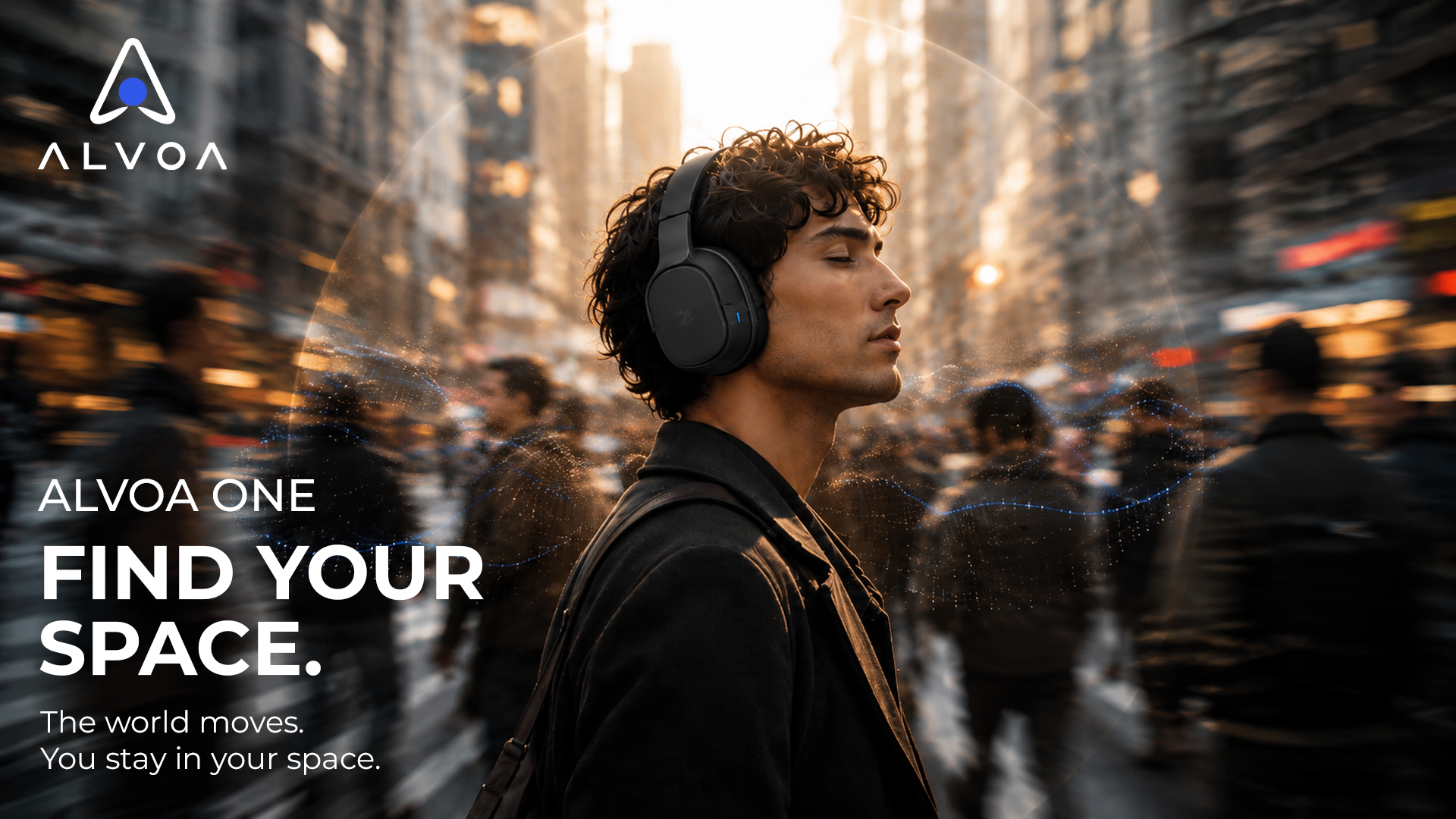

ALVOA
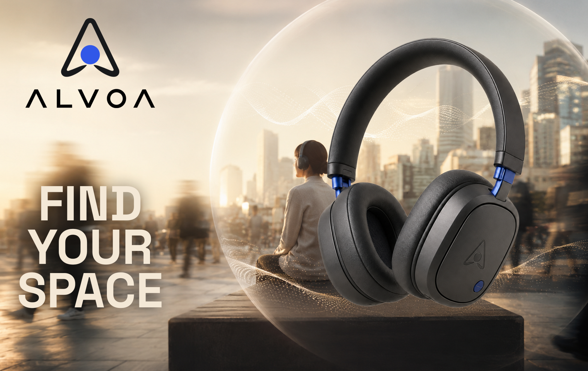
FIND YOUR SPACE.
A fictional personal-audio brand exploring how design, motion, and generative AI can turn everyday noise into a moment of personal focus.
Project: Self-initiated concept
Role: Brand Designer · Art Director · Motion Designer
Year: 2026
THE CHALLENGE
Personal audio products often compete through technical specifications, but the experience of listening is much more emotional. For ALVOA, I wanted to explore how a new audio brand could communicate the feeling of having your own space even when the world around you is busy.
How can a headphone brand sell a feeling, not just a product?
THE AUDIENCE
The audience is young professionals and creative people who move through busy environments but use music, podcasts, and sound as a way to focus, disconnect, or reset.
Designed for people who move between: COMMUTE, WORK, CREATE, STUDY, TRAVEL, RESET
THE BRAND IDEA
THE WORLD DOESN’T HAVE TO STOP. YOU JUST NEED YOUR SPACE.
This became the foundation for the brand and campaign concept: Find Your Space. This is the real heart of ALVOA.
BRAND IDENTITY

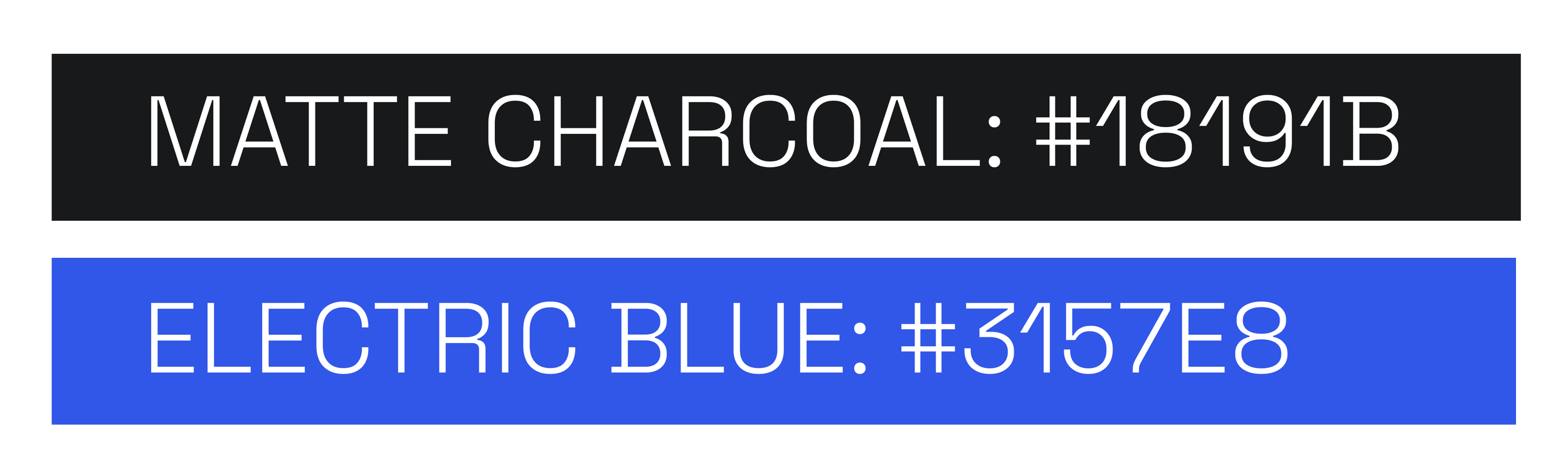
COLOR PALETTE
PRODUCT VISUAL DIRECTION
The product needed to feel recognizable without feeling familiar.
I developed a visual direction around rounded rectangular earcups, soft sculpted edges, a slim headband, matte charcoal materials, and a small electric-blue hardware accent.
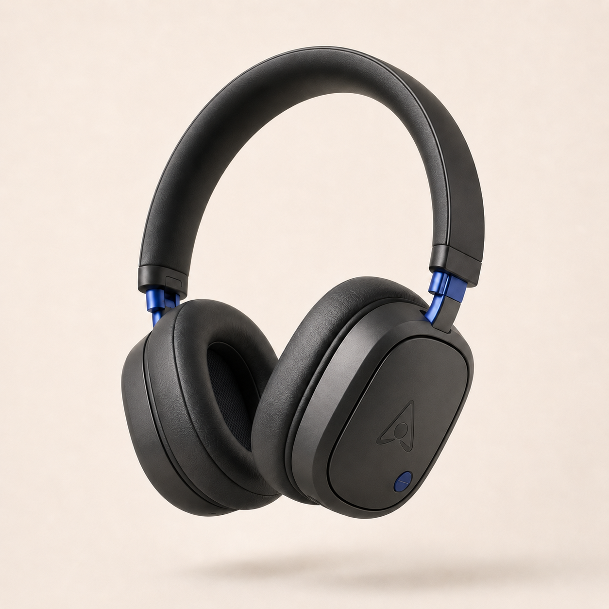
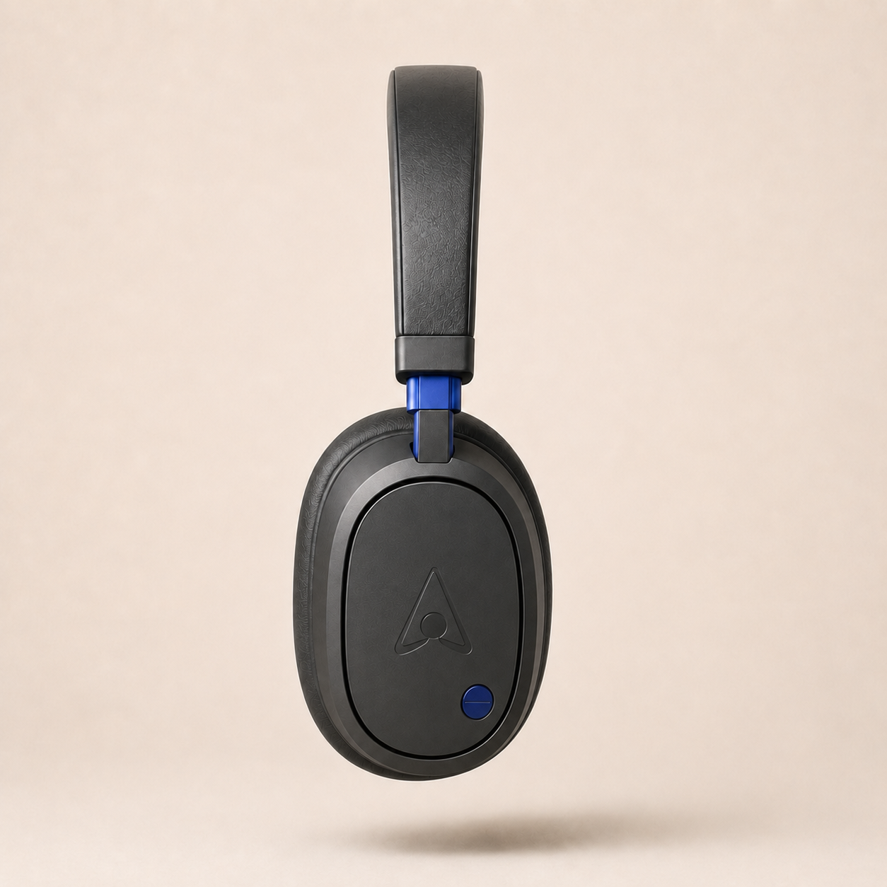
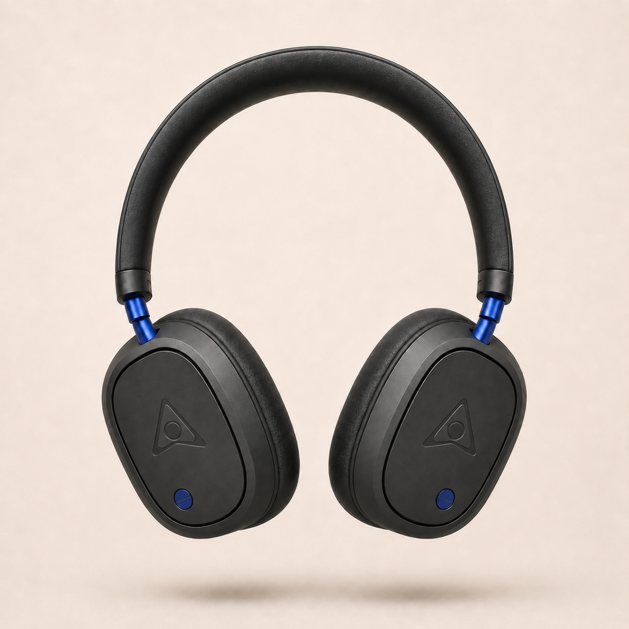
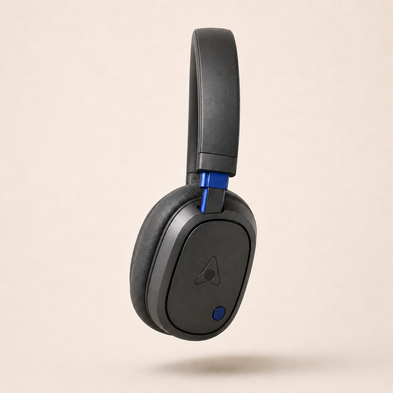
SOFT FORM: Comfort / Calm
MATTE FINISH: Quiet / Premium
BLUE ACCENT: Recognition / Energy
CAMPAIGN CONCEPT
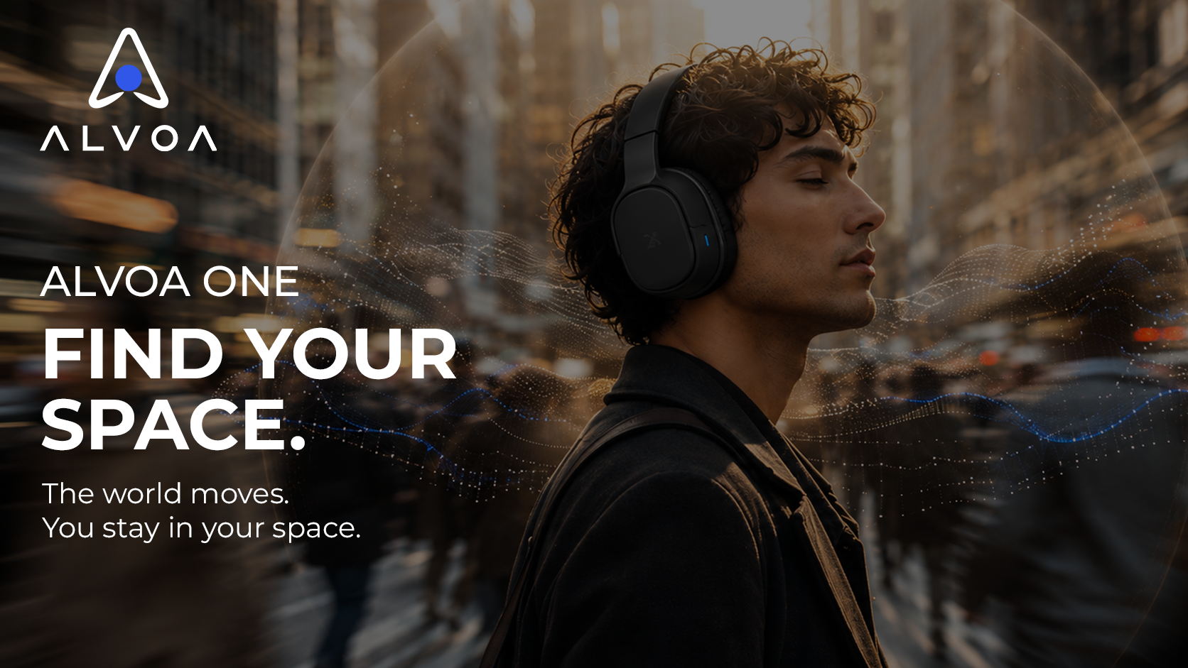
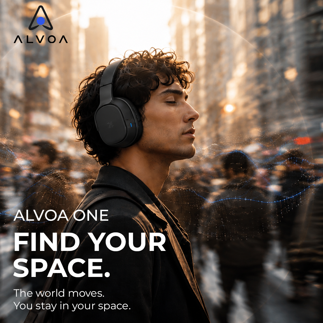
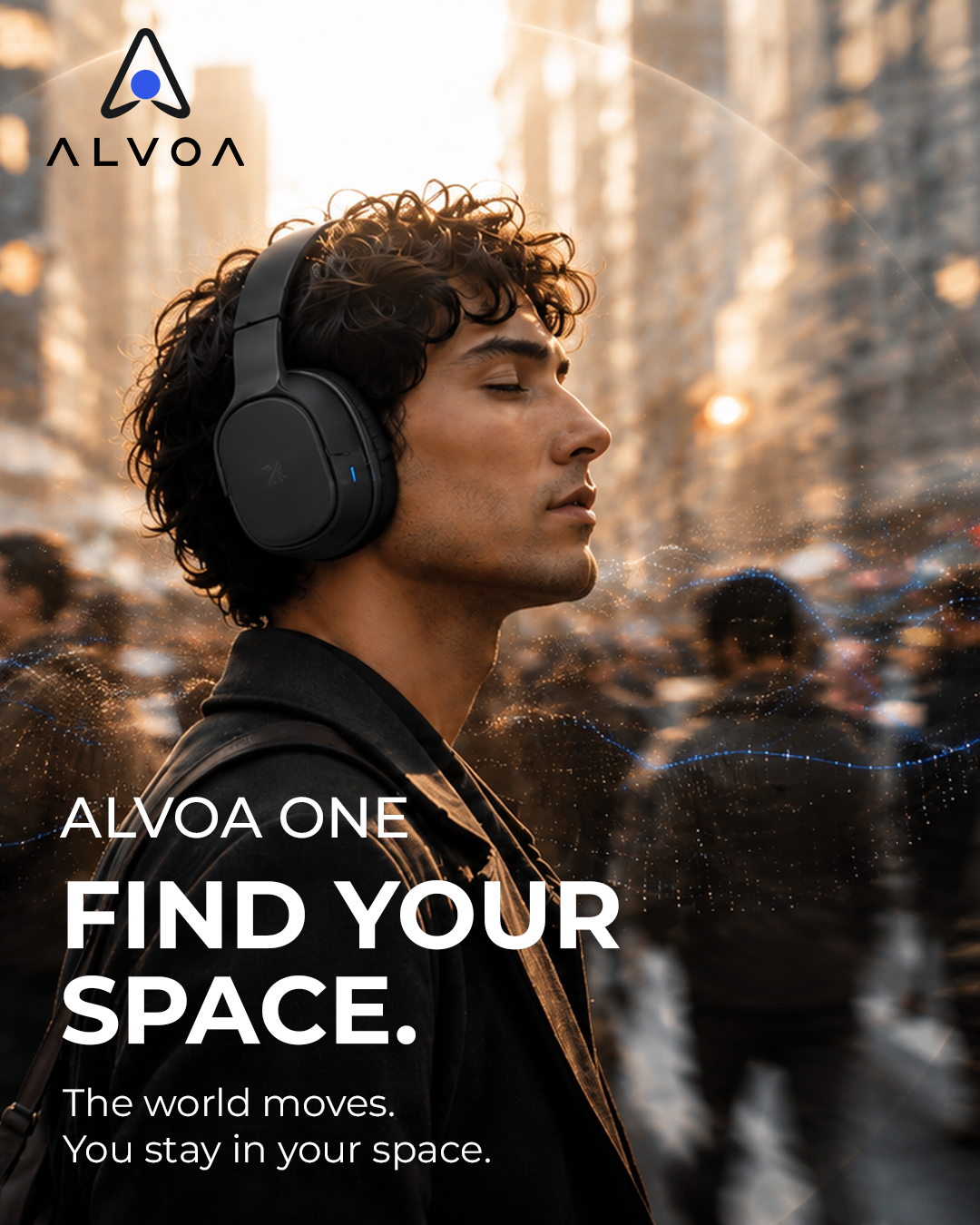
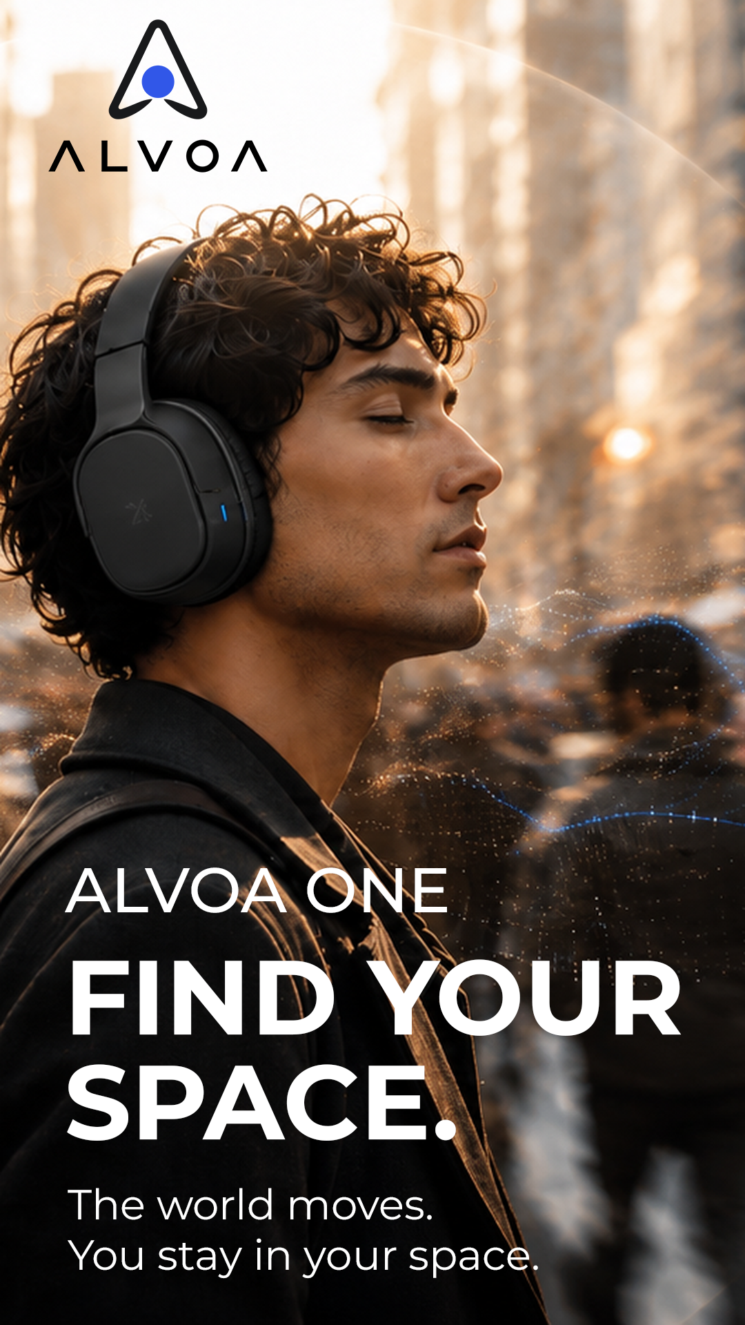
FIND YOUR SPACE
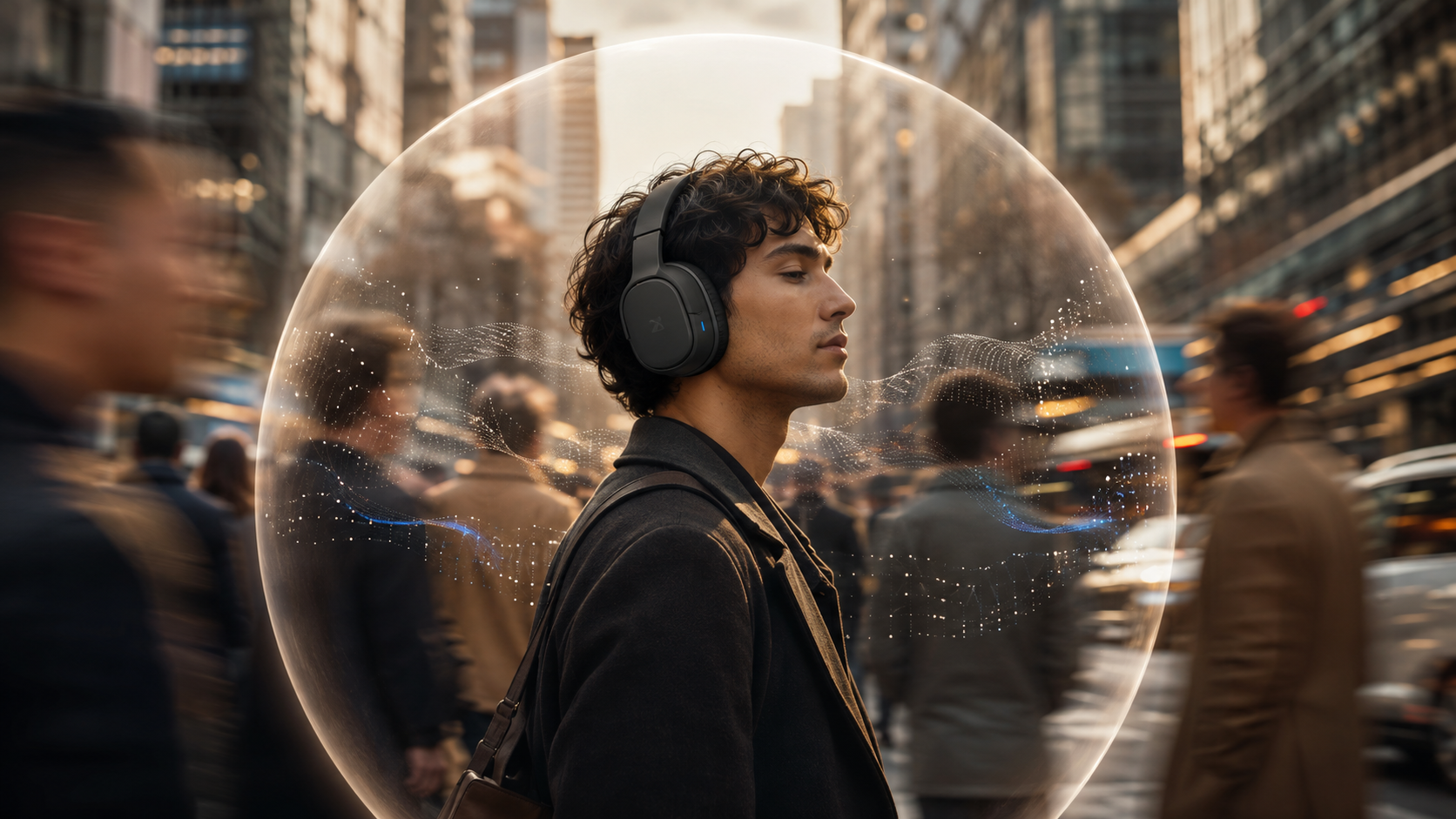
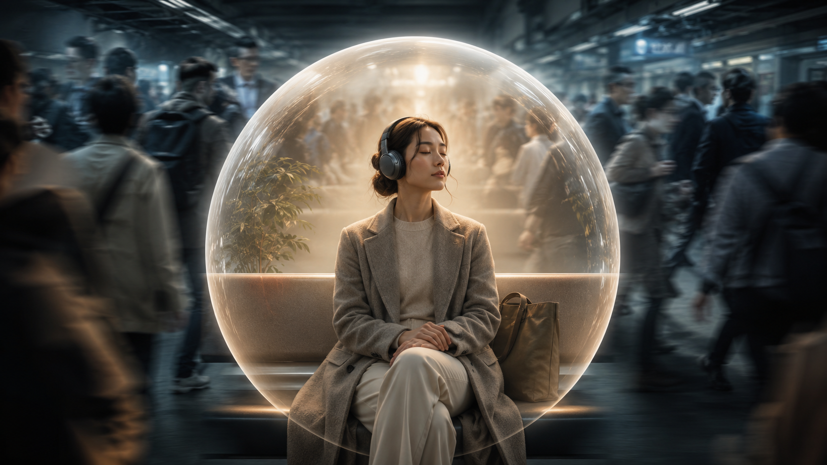
The campaign uses a visual contrast between movement and stillness. The environment continues around the listener, while the area closest to them feels calm, focused, and controlled.
INSIDE THE SPACE: Calm | Focused | Warm | Clear
OUTSIDE THE SPACE: Movement | Noise | Crowds | Distraction
BUILDING THE KEY VISUAL
From an Idea to a Visual system.
The first challenge was finding a way to show personal space without making the campaign feel futuristic or disconnected from everyday life. I explored different environments, compositions and visual treatments before defining a direction that balanced movement with calm.
Exploration 1
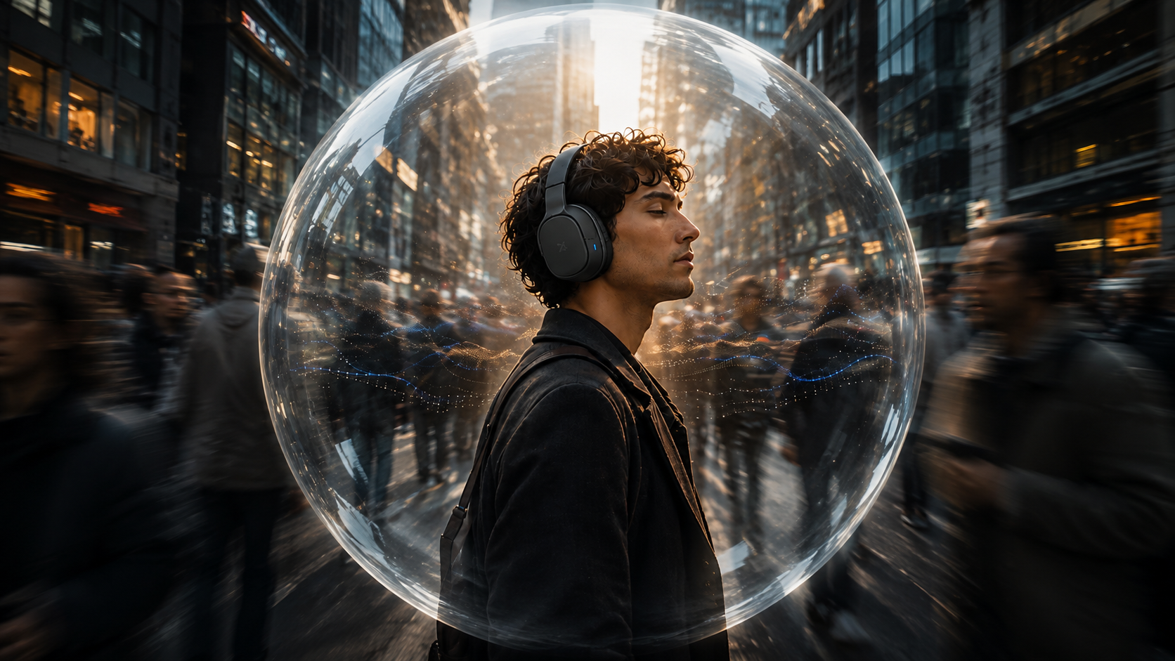
❌ Too Literal
The acoustic zone communicated the idea, but the sphere felt too physical and started to make the environment feel futuristic
Exploration 2
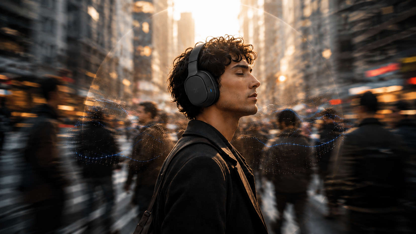
❌ Product Consistency
Some generated variations changed the proportions and details of the headphones, making the product less recognizable across the campaign
Exploration 3

❌ Visual Hierarchy
When the environment or lighting became too dominant, the product and campaign idea lost focus
SELECTED DIRECTION
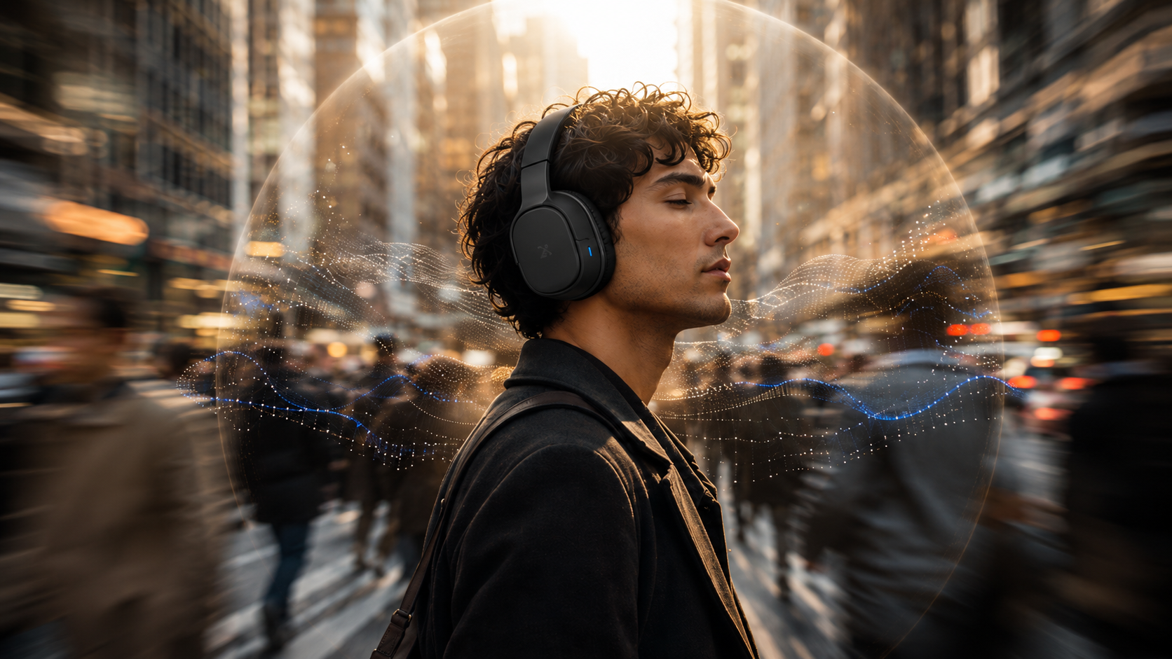
✅ Subtle Acoustic Zone
✅ Consistent Product Form
✅ Controlled Motion Blur
✅ Clear Subject Hierarchy
FINAL KEY VISUAL