

COUNSELING CONNECT
Making support feel easier to understand through motion.
Counselling Connect wanted an explainer video that could introduce its services in a way that felt simple, welcoming, and easy to understand. My role was to take their message and turn it into a visual story using illustration, character design, storyboarding, and motion graphics while keeping the communication clear and approachable.
Motion Design | Illustration | Storytelling | Visual Communication
Role: Motion Designer
Client: Counselling Connect
Deliverables: Explainer Video, Storyboard, Character Design, Illustration, Motion Graphics
THE CHALLENGE
How do you explain a sensitive service without making the communication feel complicated?
Counselling Connect offers different counselling services, so there was a lot of information that could be communicated. The challenge was to simplify that information without losing the meaning behind it. The visual style also needed to feel welcoming and supportive instead of looking too corporate, medical, or overly dramatic.
I focused on three things:
-
Keep the information simple and easy to follow.
-
Create a visual experience that feels calm and approachable.
-
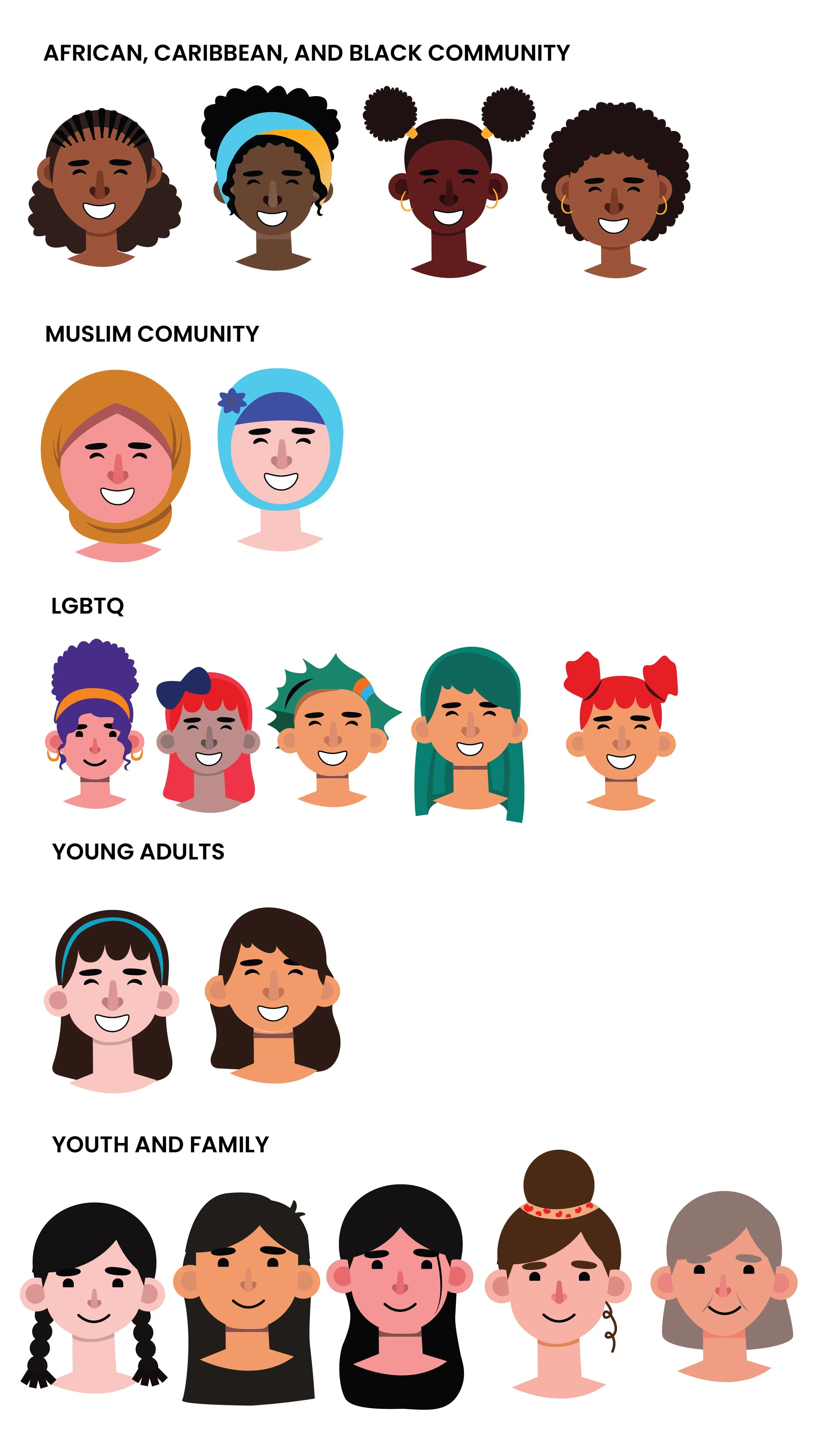
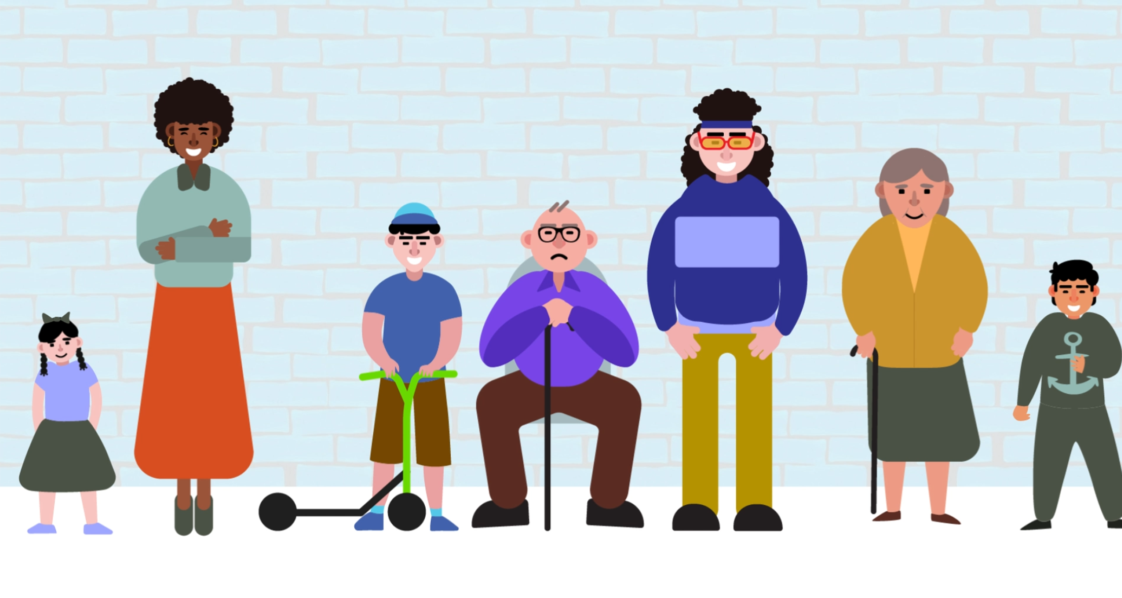
Use characters and storytelling that could connect with a diverse audience.
THE IDEA
Make it feel more like a conversation than an explanation.
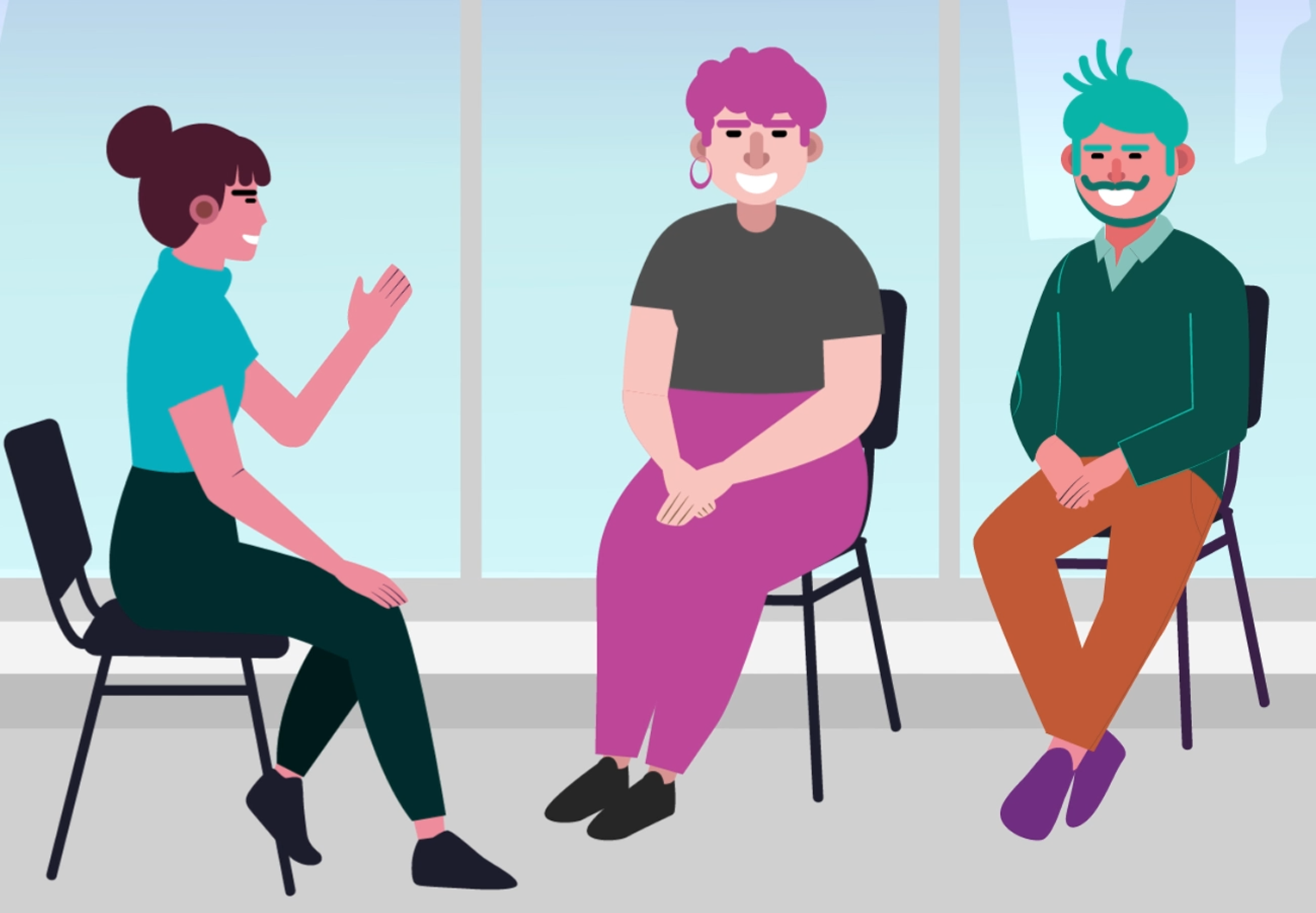
I didn't want the video to feel like someone was giving the viewer a list of services. Instead, I wanted the animation to guide the viewer through the information naturally. The characters, colours, movement, and pacing were developed around this idea. The goal was to keep everything friendly and simple while still communicating the important information clearly.


UNDERSTANDING THE CLIENT
Before designing, I needed to understand what they wanted people to feel.
I started by speaking with the organization about their audience, message, and the tone they wanted for the video. These conversations helped me understand that the project was not only about explaining the service. The way the information was presented was equally important. That became the foundation for the visual direction.
FROM MESSAGE TO STORY
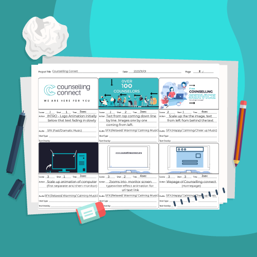
Once I understood the direction, I started breaking the information into scenes. Instead of immediately going into animation, I used storyboards to plan:
What does the viewer need to understand? → What visual can communicate it? → How should one scene move into the next? → How should the overall story feel?


VISUAL DIRECTION
Soft, Simple, and Approachable.
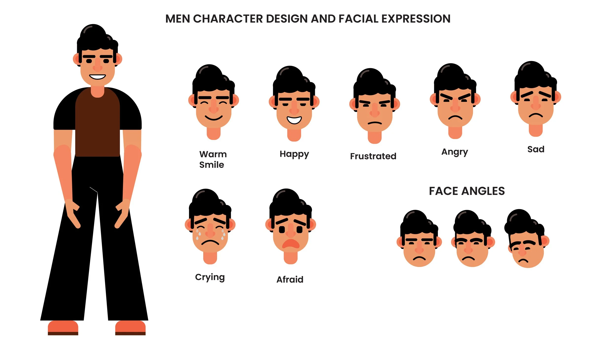
I wanted the visual language to support the message rather than becoming the main focus. I worked with softer colours, simple character designs,
and clean compositions to keep the scenes friendly and easy to understand. The characters were especially important because I wanted the
communication to feel more human and relatable.
MOTION
Movement was kept smooth and controlled rather than fast or distracting.
CHARACTERS
Simple character designs helped communicate different situations without adding unnecessary visual detail.
COMPOSITION
Clear hierarchy helped keep the viewer focused on the important message in each scene.
COLOUR
A softer palette helped create a calmer visual environment.