
STEL ASTRA VENTURES LLP
Creating a visual identity built around movement, direction, and global connection
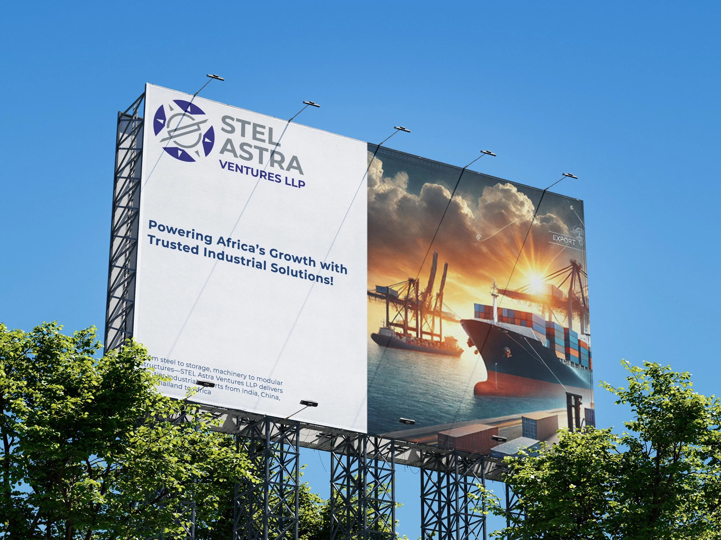
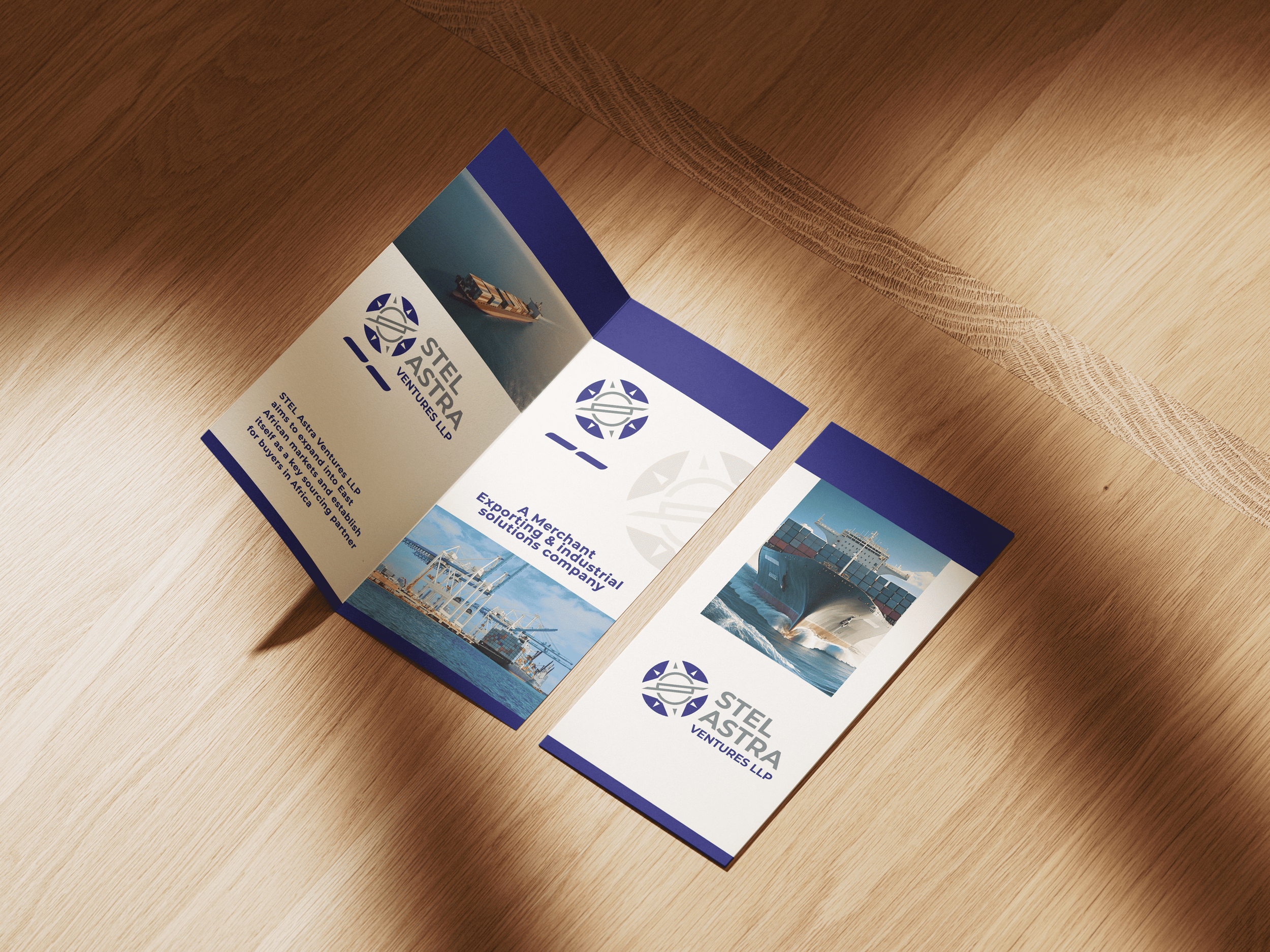
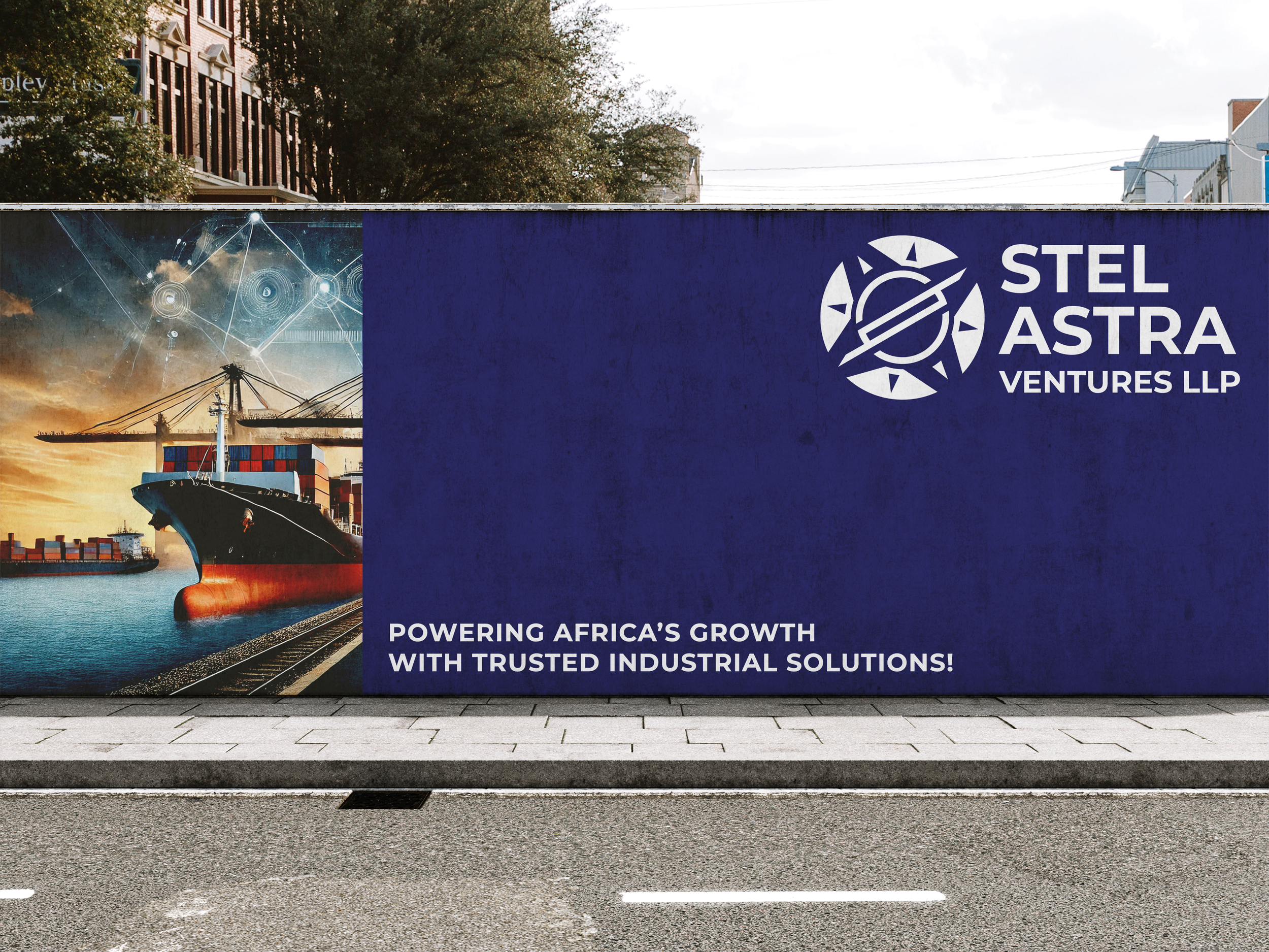
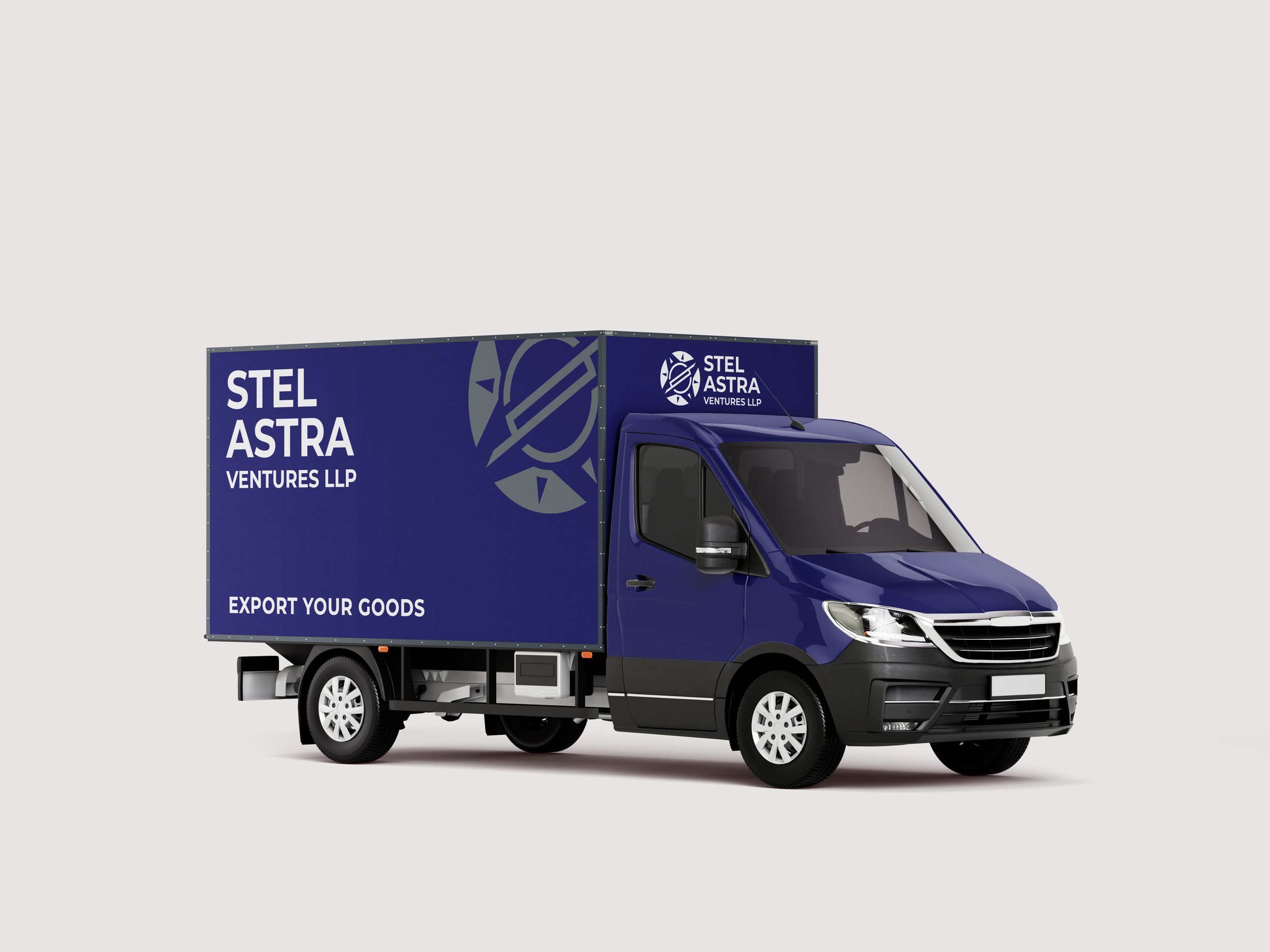
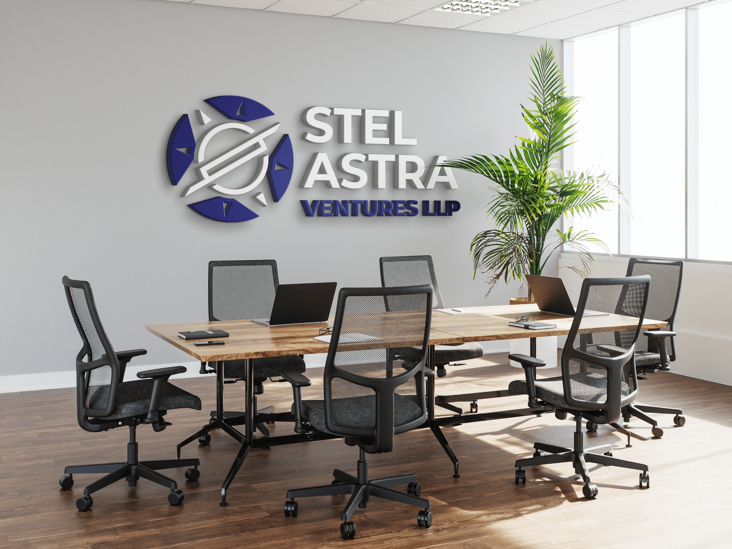
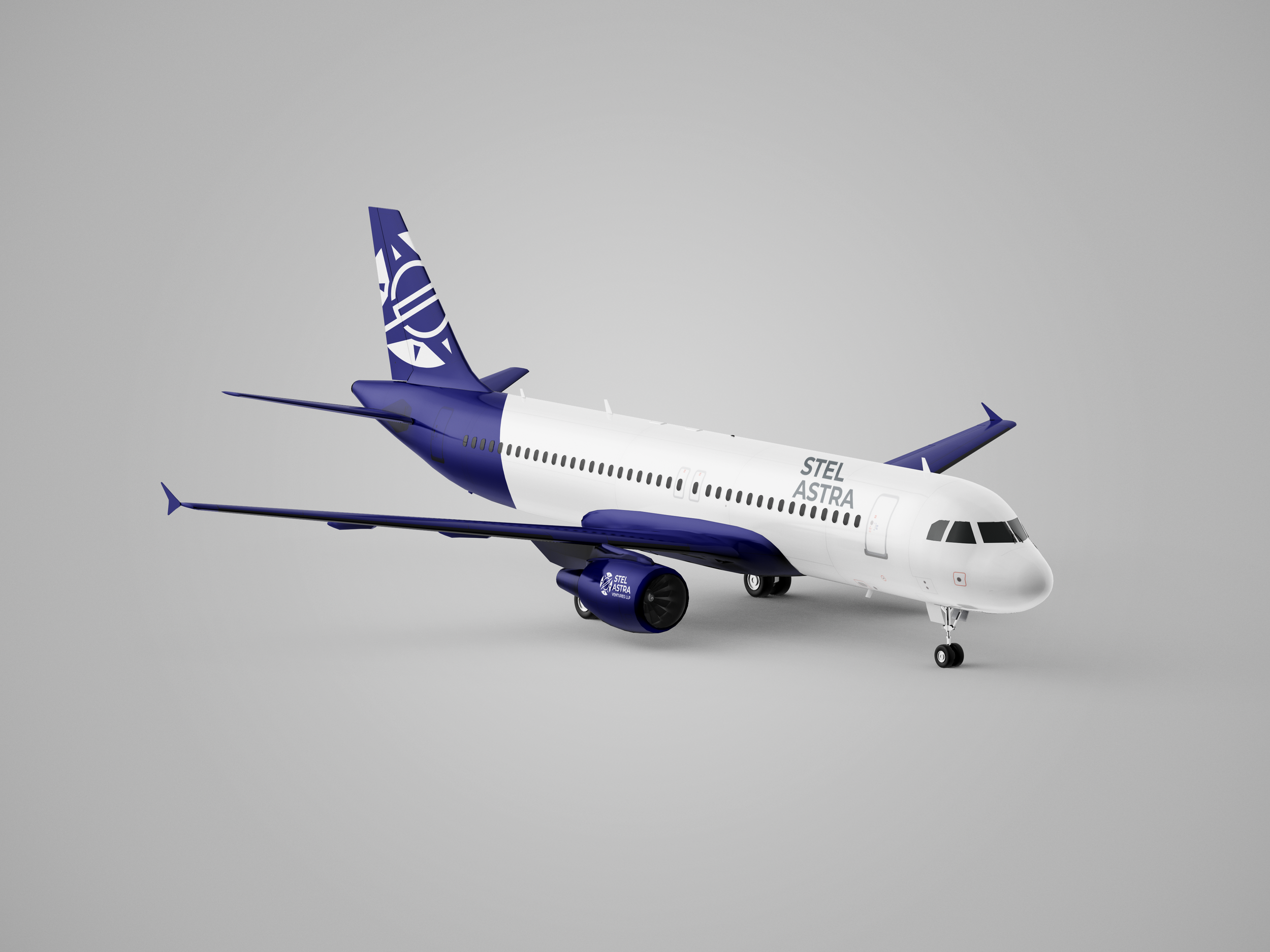
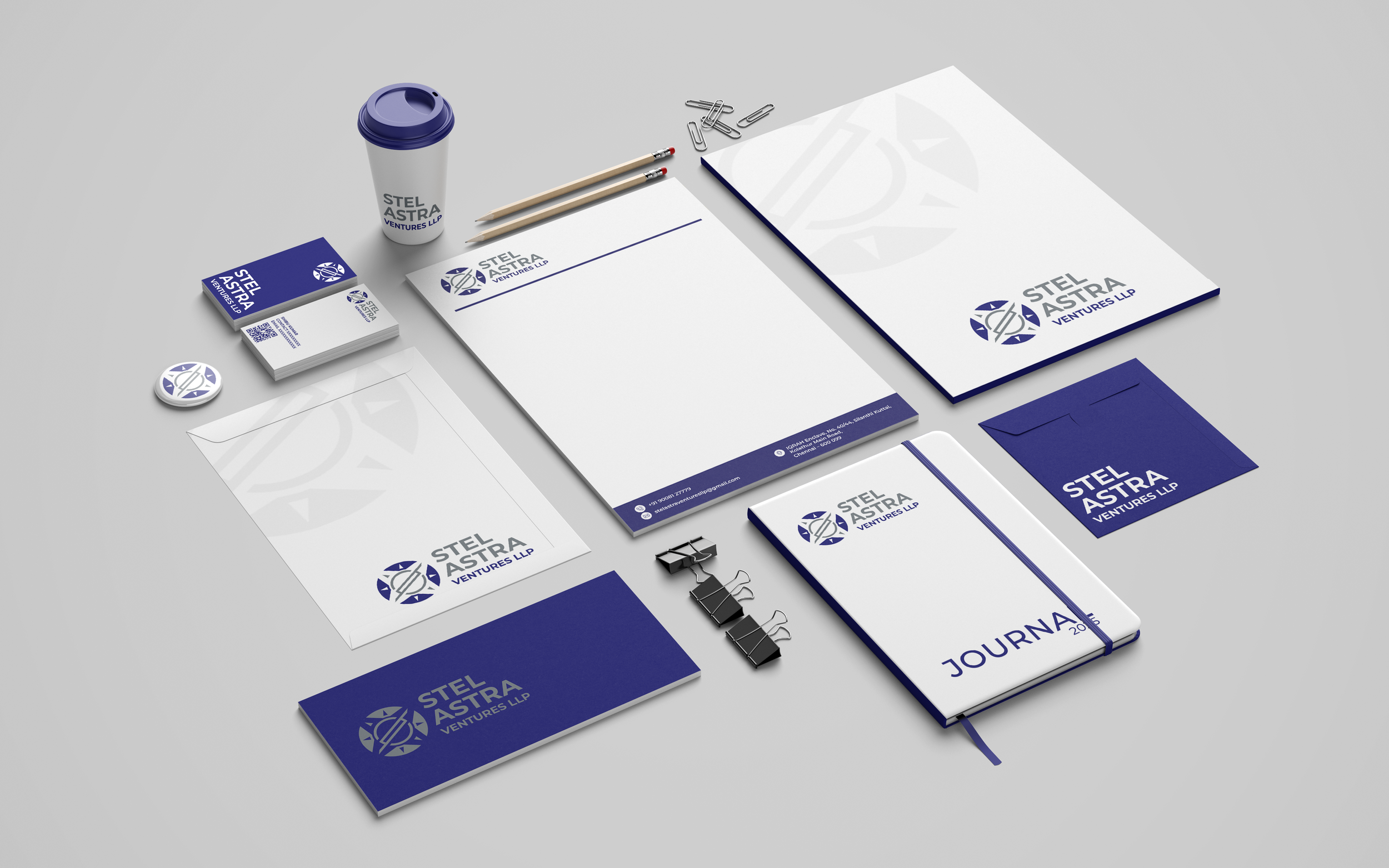
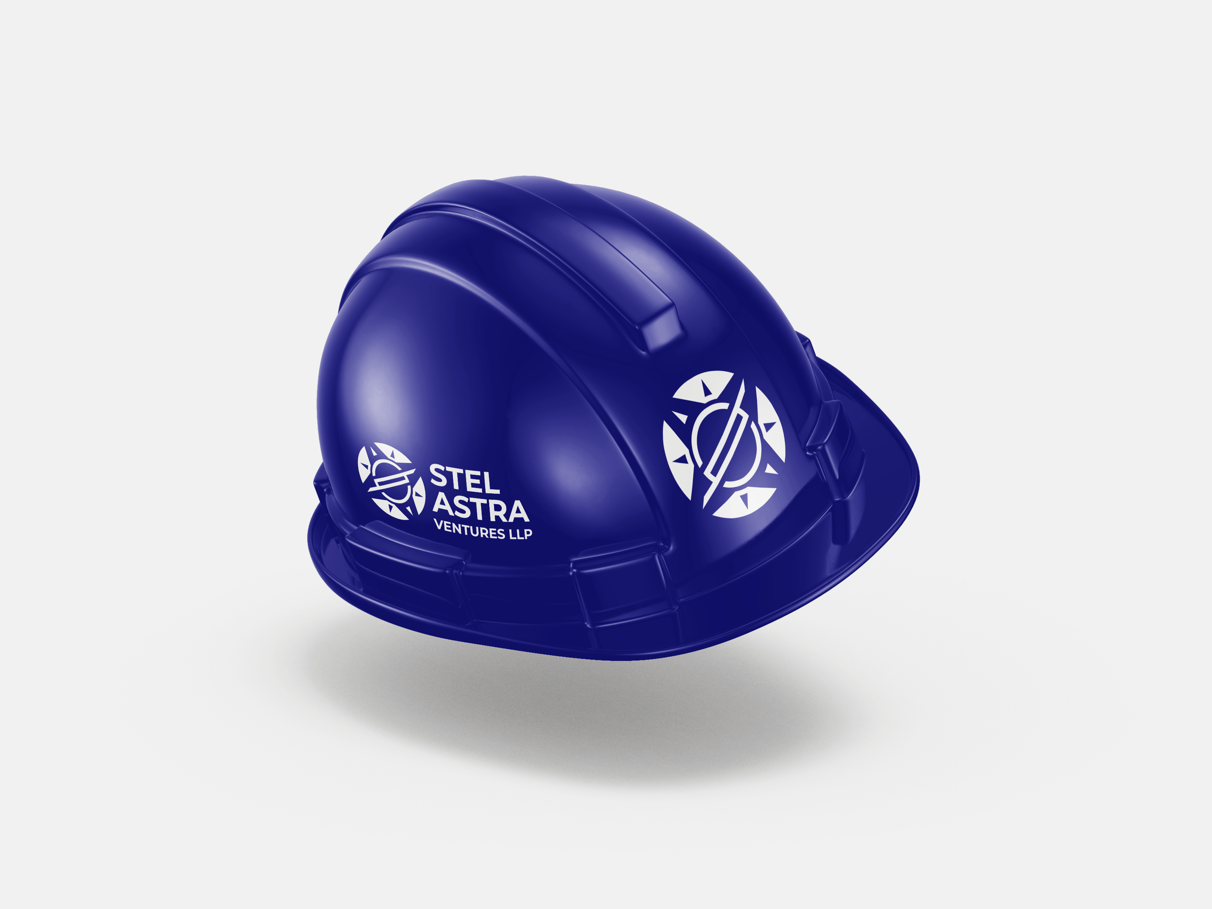
Stel Astra Ventures needed a visual identity that could represent the company across different business and communication materials. My goal was to create something professional and recognizable, but also flexible enough to work across different applications, from business cards and stationery to packaging, transportation, and large-format branding.
Brand Identity | Logo Design | Visual System | Print & Digital
Role: Graphic Designer
Client: Stel Astra Ventures LLP
Deliverables: Logo Identity, Colour System, Typography, Business Collateral, Packaging, Vehicle Branding
THE CHALLENGE
How can one symbol represent movement and global ambition?
The identity needed to feel professional and established while also communicating ideas of movement, direction, and reaching beyond boundaries. Since the logo would appear in many different places, another important challenge was creating a mark that could remain recognizable at different sizes and in different formats. I wanted the identity to work as more than just a logo.
It needed to become a visual system that the company could use consistently.

THE CONCEPT
Building the idea from simple symbols.
The logo was developed by combining visual ideas connected with the name Stel Astra and the character I wanted the brand to have.
STAR
The star became the starting point for representing ambition and moving toward something bigger.
ORBIT
The circular and orbital form brings a sense of movement and connection.
DIRECTION
The surrounding directional shapes create energy around the symbol and help the identity feel active rather than static.

EXPLORATION
The final idea came after trying different directions.
Before choosing the final symbol, I explored different ways of combining the name, star imagery, geometric forms, and typography. Some directions were
more decorative, while others were too complicated or did not have enough visual balance. The final direction felt stronger because it was simple enough to
recognize, but still had a connection with the idea behind the brand.


THE LOGO SYSTEM
One identity. Different situations.
The logo needed to work across different layouts and sizes, so I created multiple configurations instead of depending on one fixed version.




COLOUR PALETTE
A simple palette with strong contrast.
The combination gives the identity strong visibility and allows it to work across light and dark backgrounds. The darker blue creates a professional foundation, while silver brings energy and premium, which makes the identity easier to recognize across applications.

TYPOGRAPHY
MONTSERRAT
Montserrat was selected for its clean geometric structure and strong readability. Its bold forms work well with the geometry of the logo while keeping the overall identity modern and straightforward.
FROM LOGO TO BRAND
The identity needed to work outside the presentation.